Published
on
November 1, 2017
| 1,053 views
| 2 followers
members are following updates on this item.
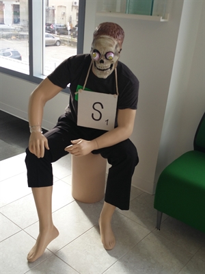
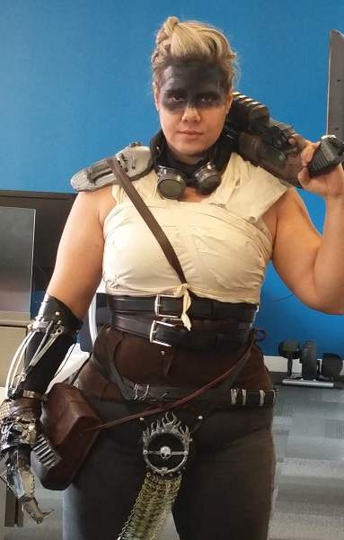
 It's the day after Halloween, and with all the pictures from our office costume contest, it seems like there's no better time to talk about images. One of the questions that comes up a lot from Administrators and publishers is how best to format images to look exactly as they want in their digital workplace.
Image sizing can be a huge challenge, between members using different screens and devices to images appearing in different areas and contexts, including in Channels, on posts directly, and in widgets on Pages.
Today I'll outline the basic principles for how Igloo handles images, and give you the tools to ensure that they look right every time, and in every place.
 Aspect ratio, the ratio between height and width, is the most important thing for images in Igloo. No matter how you resize an image, the platform is always going to do everything it can to preserve the original aspect ratio. Without that ratio, images can look squashed or stretched, like the one on the right.
Format also matters. JPG files may conserve space, but they lack the information necessary to stretch or adjust effectively. PNG files can easily adapt to lots of different screen sizes without any issue in display.
 Tall Images
Tall images cover most basic use cases, and a 3:2 ratio is recommended. 600 pixels x 400 pixels can suit most articles and posts, and can be pulled into widgets easily. If you'd like to use the image in a full page width widget, a 2:1 ratio works as well.
Tall images like that can then be set inline and aligned with the image tools available when selecting the image.
Wide images typically see use in banners or slideshows, and are designed to stretch across the main column of your Igloo, or even further outside those bounds. A 1:4 ratio will help the image resize to fit different devices without taking up too much space on the screen. The image below fits the ratio, and has the width set to 100%.

 The recommended aspect ratio for a square image is 1:1, squares being what they are.
However, it's also important to think about the focal point of the image. If the image is cropped in other areas of the platform, ensuring that the focal point of the image is in the center helps you be sure it will be included no matter where or how the image loads in your community.
Recommended sizes for square images are 45 pixels x 45 pixels for smaller images, and 150 pixels x 150 pixels for larger ones.
If you have questions about the Igloo platform, workflows, or best practices, you can leave a comment here, or ask a question in the Community area.
Page Options
2 Comments
Thanks Jim!
Jean Do - I wanted to ensure you saw this post. :)
Thanks for sharing this info, Jim. I am wondering if an average user should be burdened with these instructions, or if the image should simply look good every time they post?