Published
on
August 2, 2017
| 736 views
| 0 followers
members are following updates on this item.
When you first start your Igloo, there are a ton of ways to customize the appearance. You can add your logo and determine its position, select a theme from the theme library, and arrange the architecture and widget structure to suit your needs. The custom CSS option in the Appearance tab of the Control Panel lets you style everything from individual widgets to people's profiles, and that's what's on the agenda for today. If you'd like an introduction to using CSS in Igloo, head over to our first CSS Success article.

Every field in the profile has its own class that you can target and change with CSS, altering fonts, colors, and the shape of the container itself. In order to affect the contents of a field, you'll need to target the <span> that's present inside the container. We can highlight the job title with some very bright colours using the following code:
.wr-occupation span {
 background-color: yellow;
 font-weight: bold;
 font-size: 20px;
 color: cornflowerblue;
}
Any field in the profile can be targeted like this, affecting padding and margins as well as colour. You can find the class by using your browser's Inspect feature on the field you'd like to style.
By targeting the same classes, you can hide fields from view using display: none or visibility: hidden. The difference between these is subtle, but important. Using display:none makes the item vanish entirely from the page, which could rearrange other page elements to fill the space. Visibility: hidden will preserve the structure of the page, but hide the specific field that you're targeting. We can hide the country field, for example, with the following CSS:
.wr-country {
 visibility: hidden;
}
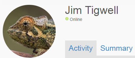
Tired of the default photo provided by the platform? You can change it to whatever you like with a trickier piece of CSS. In order to use this, you'll first need to upload the photo you want to use instead of the default to a folder channel in your community. Set up the Access to let the All Members Group read it, too. Pictures are subject to the same Access rules as everything else, so unless a person has access to it, it won't be visible to them. Finally, right-click on the Download button and copy the url. You'll need to plug that into the code below.
.ig-thumbnail-175-none, img.ig-thumbnail-175-none {
background: url("your link goes here") no-repeat !important;
height: 175px;
width: 175px;
}

Now you can have a default picture that really stands out, or one that fits the look and feel of your brand. These small customizations can be a great tool for making your community's appearance and message consistent, clear, and welcoming.
For more information about using CSS in Igloo, you can ask a question in the Community area.
Page Options